
Layout: Full Width Bands
This site, like many others, uses a layout of what I’m calling “full width bands” of color—where the header, content and footer backgrounds stretch the full width of the screen. It’s a nice effect, and is easy to do. Below is a link to a demo / example template that you can use in your own designs.
How It Works
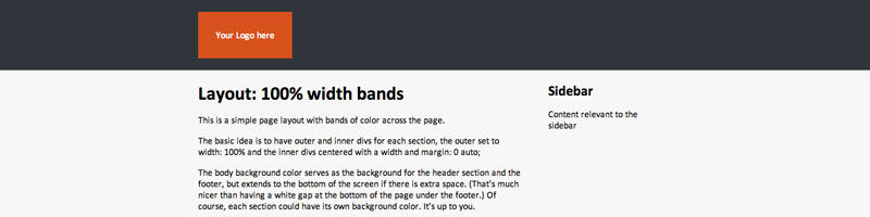
The basic idea is to have outer and inner divs for each section, the outer set to width: 100% and the inner divs centered with a width and margin: 0 auto;. Here is the HTML:
<div class="header-outer">
<div class="header">
</div>
</div>

<div class="main-outer">
<div class="main">
</div>
</div>

<div class="footer-outer">
<div class="footer">
</div>
</div>
And here’s the CSS:
.header-outer, .main-outer, .footer-outer {
width: 100%;
}

.header, .main, .footer {
margin: 0 auto;
width: 50em;
}
Now, you can set full width colors for the header, main and footer sections. However, I prefer not to have the appearance of a gap under the footer on shorter pages, so I prefer to set a background color on the body element that then serves as the background color for the .header-outer and .footer-outer sections, but also means the footer color will extend to the bottom of the page no matter how short it is. You could, of course, have a different color for the .header-outer section if you prefer.
The body background color serves as the background for the .header-outer section and the .footer-outer, but extends to the bottom of the screen if there is extra space. (That’s much nicer than having a white gap at the bottom of the page under the footer.) Of course, each section could have its own background color. It’s up to you.
At any rate, you need to set a background color for the .main-outer section.
body {
background: #30353b;
}

.main-outer {
background: #fff;
}
In my example, the .header, .main and .footer divs are given a width in ems to make them more elastic, but the columns within the .main div are given % widths so that they will adjust in width on narrow browsers. (Squeeze the browser to a narrow width to see the effect. Also try zooming in on the page to see how nicely everything fits at a large size.)
The .header, .main and .footer divs are set to overflow: hidden to ensure that they encose any floated content within them.
@media rules are added so that, on small screens like handhelds, the floated columns will be unfloated.
For more details on the fluid/elastic nature of this layout, see my Fluid, Elastic, Fantastic! article.
Legacy Comments
Been trying to find this method for a while. thanks for great examples and clear explenation. I’m fairly new to CSS and I’ve been trying to do a similar effect but with several sections all with different background color. (for example home, about, gallery, contact all with different background color on the same page.) I’ve tried using the same technique but for some reason the ‘main outers’ for the new sections aren’t showing on the page? I would really appreciate if you could clarify how to add these additional sections? (I’m at work at the moment but I could sent you a copy of my code later today if that helps) Thanks in advanced.
Hm, following the pattern in the example should work without a hitch. One thing that can go wrong is that, if you have floated content inside a section, the section itself can close up and appear not to exist, because the floats hang out of the container. To fix that, you can set the container to
overflow: hidden. E.g.For a fuller explanation, check out my post on containing floats.
And if that doesn’t help, feel free to post a link to your page and I’ll have a look.
Thank you so much for the layout, it is exactly what I was looking for.
I love the @media for mobile devices and I would like to know if it is possible to add other @media rules for larger screens.
Thank again.
Thanks Carmen.
It certainly is. You can set rules for any screen size, such as specifying styles on screen above a certain width. E.g.
I recommend you google something like “introduction to @media queries”, as there’s a ton of information online, and it would be hard to summarise it all here.
Hey, great article, have seen this done on a few websites and wondered how it was done. I just need to create the “main” div as when changing the body background it changes the whole page. But see exactly what you’re doing here.
Keep up the good work!